Visual Identity & Branding
.png)
Creating conscious and unconscious connections
Sometimes, during the UX Designer journey, we come across projects that need a visual identity, before developing or improving them as products. This can include logos, typography, and other design elements.
So, I'll share some visual identities with you!
Drone-Hand is a venture that intersects technology and agribusiness. This is an application that, connected to any drone equipment, monitors farms, especially livestock.
This project was exclusively for the logo and after our initial meeting it was decided that it should be something simple, clear and that communicated to the target audience (farmers) exactly what it was about - without ambiguities or subliminal messages. In this sense, the customer's request was something that would bring a sense of vision/perspective to the farm.
In a complementary way, we defined the use of colours from nature and with a strong relationship with agriculture and it is clear that green needed to be included. Furthermore, I included a touch of Australia: the intense orange sun that is a symbol of this country and a fundamental part of life on farms.

Social Radar is an application that seeks to connect people based on their location in real-time.
The logo was designed to represent the radar in organic shapes and at the same time, a network. Separate versions of the icon and name were also developed.
Blues were chosen because it is a colour that brings trust and is used on social networks such as LinkedIn and Facebook.


Iniciativa RZ is a Saas startup. The letters R and Z represent its founders, two brothers.
Commonly used to open and close programming codes, the symbols "<" and ">" were applied as part of the letters in the logo.
In the initial brief, it was requested not to use blue - a common color in the Tech and business industry. That's why we chose purple in a vibrant tone, still with a tech feel, but bringing innovation and energy.
_edited.jpg)
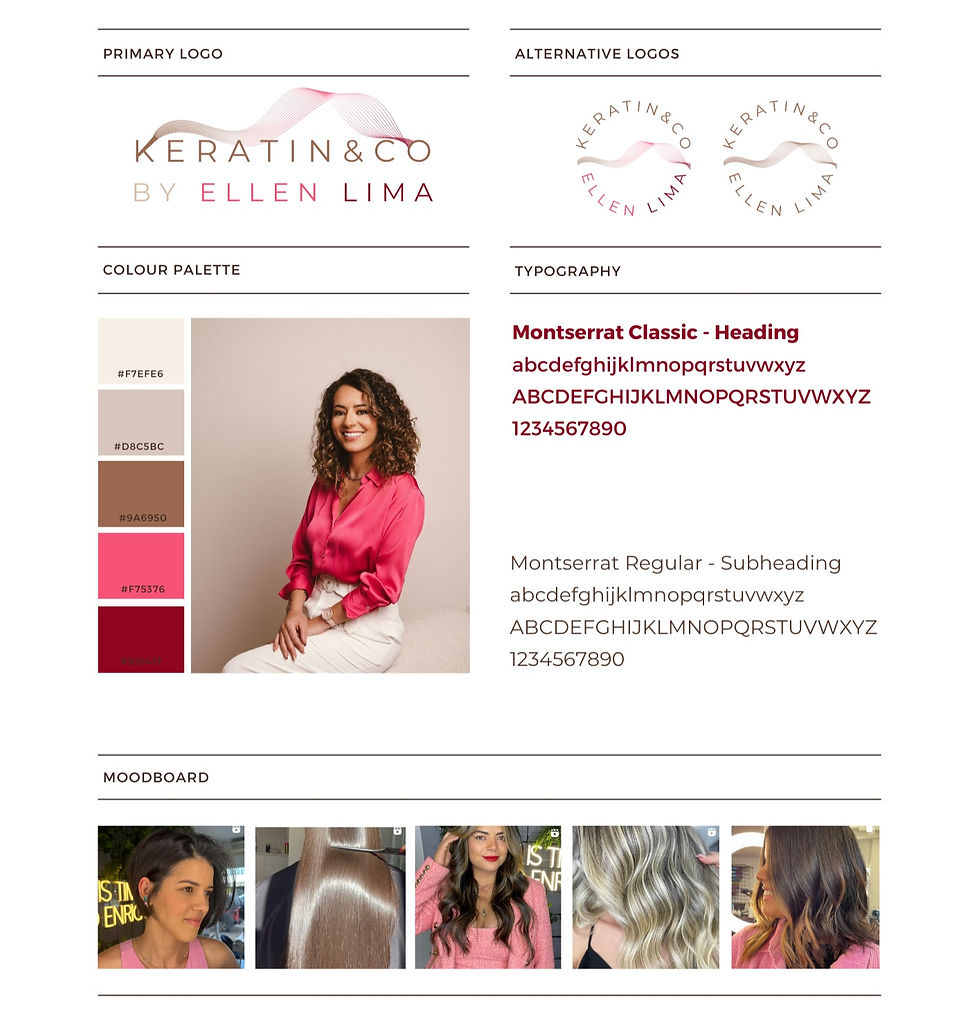
Keratin&Co is a brand owned by hairdresser Ellen Lima. She specializes in keratin straightening.
In the logo I wanted to bring the brush used to apply product to the hair strands, also represented. To counter the curved lines, the font used is straight and simple.
The colours seek to bring femininity, with a touch of pink, and natural and soft hair tones, with brown gradients.
_edited.jpg)
_edited.jpg)